

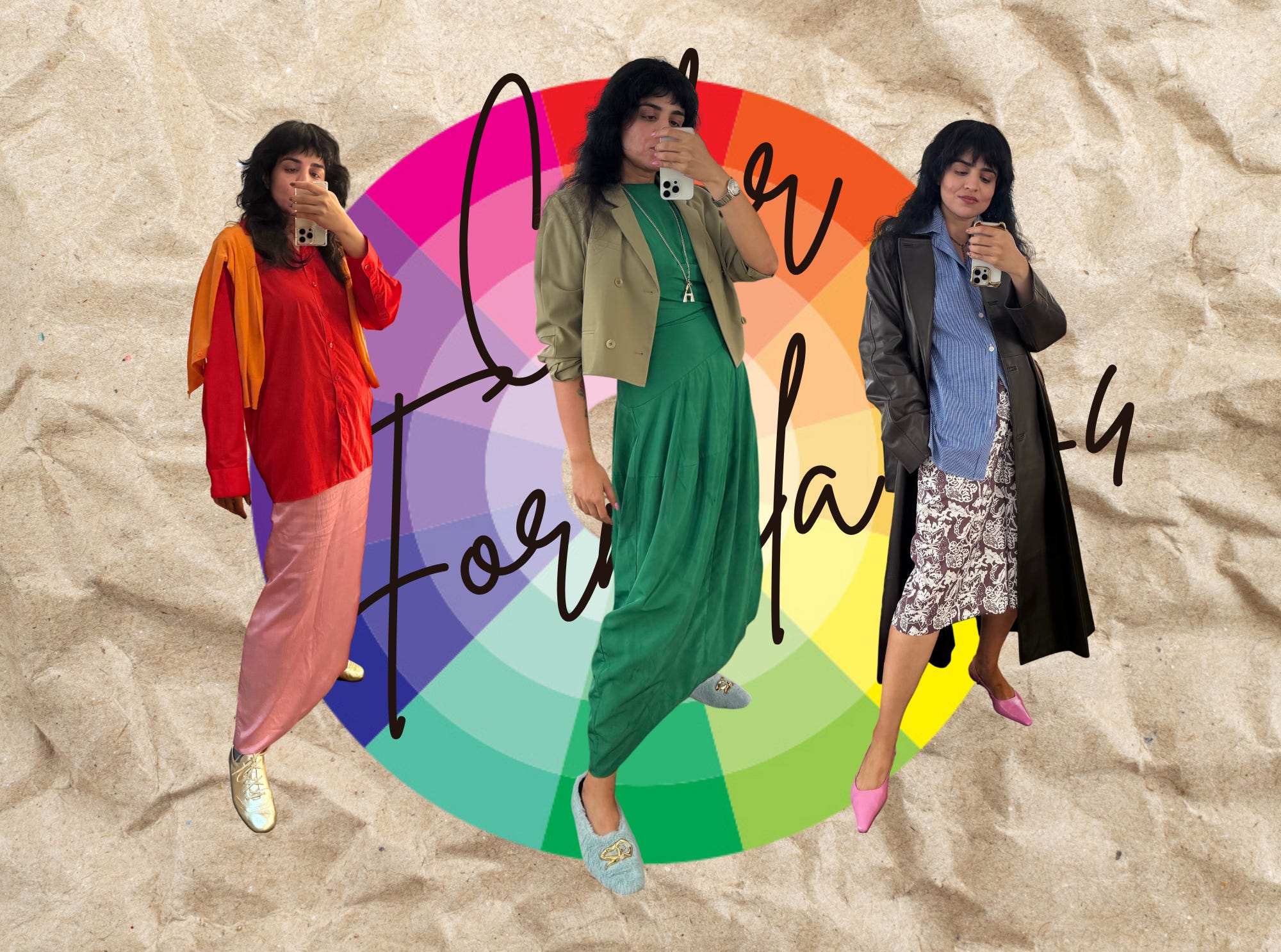
The only 2 color blocking techniques you’ll ever need: Color Formula #4
Why proportions and intensity matter more than the colors themselves
First, let’s get one thing straight: there’s no single right way to do color. All my color formula posts are just a way. A shortcut you can try if you’re stuck, or if you want to push your outfits in a certain direction.
That said, some combinations are trickier than others. Color blocking is not as simple as “throw two colors together.” If it were, we’d all be doing it daily.
Here’s my shortcut for making color blocking instantly easier. It comes down to two options:
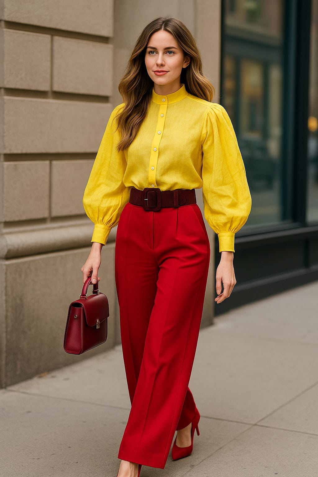
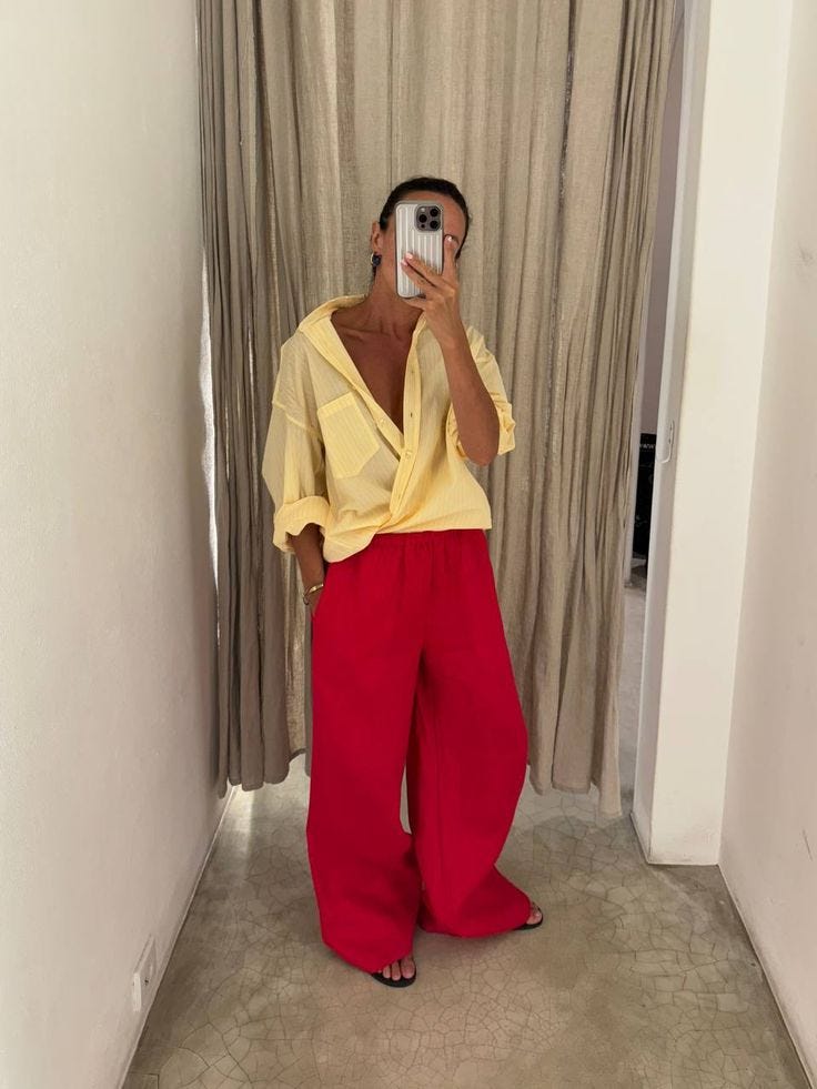
1. Equal split? Change the intensity.
If you’re splitting two colors 50/50 — say, a top and a bottom — make sure they differ in value or saturation.
Value = how light or dark a color is (add black or white paint).
Saturation = how pure or muted a color is (straight out of the paint tube vs. dusty/faded).
If this still sounds complicated, here’s the easy version:
Don’t pair neon with neon. Don’t pair pastel with pastel. Don’t pair bright with bright. Don’t pair like with like1.
Example: Bright red top? Skip cobalt trousers (both equally bright). Try denim blue, soft sky, pastel, or deep teal instead.
Why: When both colors are equally loud, they compete. Shifting one to be lighter, darker, or more muted gives the eye a place to rest.
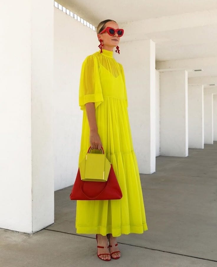
2. Same intensity? Change the scale.
If your colors are similar in value and saturation — two brights, two pastels, two deep tones — don’t split them evenly. Make one the hero, the other the accent.
Example: A yellow bra peeking out under a red dress. Or an emerald bag with a cobalt outfit.
Why: If they’re equal, they blur together. Changing the proportion makes it look intentional.
So don’t do this when trying to do this formula:
Do this:
Or this:
My cheat code
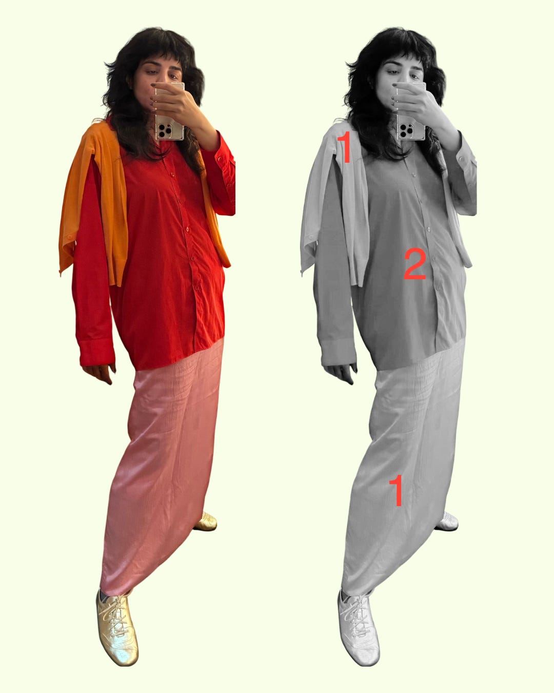
If you can’t tell how different two colors are in value/saturation, flip your photo to black & white on your phone. If they look like the same grey, they’re too similar. For example, in my outfit below, the cardigan and the skirt and roughly in the same vicinity of value and saturation, but there’s a lot of skirt, and very little cardigan.
I’ll say this again because it matters: there are no “wrongs” here. You can break every one of these guidelines and still pull off a killer outfit — it just takes more styling ninja-ness. These shortcuts keep it simple if you’re still building intuition about color.
My priority when pairing colors is always nuance. And two colors, equal in proportion and intensity, are the hardest to make look nuanced. Even the boldest combos feel elevated when you build in contrast somewhere — either in intensity or in proportion.
Now, let me show you how this plays out in my own dressing.
Here are examples of the first technique, where I have varied the value and saturation in tops and bottoms:
1. Equal split? Change the intensity.
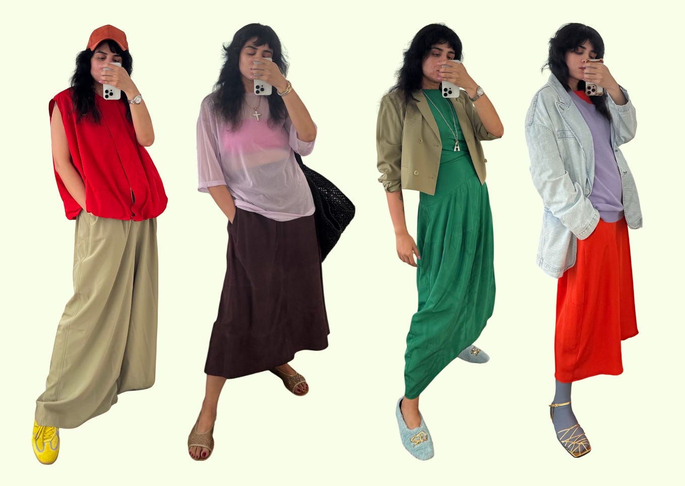
2. Same intensity? Change the scale.

Color blocking can feel intimidating, but it really just comes down to contrast. Change the intensity or change the proportions, and suddenly the loudest colors start to feel intentional instead of chaotic. Because contrast adds nuance. And once you see it, you can’t unsee it. Your brain will start spotting these patterns everywhere, in your closet and out on the street.
PS: No affiliate links here, and I hear Substack is suppressing reach of accounts that don’t offer a paid subscription. So truly the best thing you can do to support me is like this post, comment, and share it with your network (including with people not on Substack). I super appreciate all of your support. And if you missed it earlier, definitely check out the other color formula posts:
Color Formula #1: The Four Neutrals

Since y’all loved Color Formulas #2 and #3, here I am with Formula #1. Before we dive in, can we take a second to acknowledge how good you all looked in Formula #2? The DMs, the screenshots, the unexpected twists on tonal, all of it. I’m floored. There’s something really satisfying about seeing a shared idea take on so many different forms. It proves wh…

Color Formula #3: Flirty Neighbors

What a coincidence that everyone’s writing about color right now, right?
Again, ONLY if you’re trying to do this formula. Of course those colors CAN be paired well together very successfully.
I’ve been looking over my recent Indyx and I’m seeing the subtle influence of your unbelievable wisdom: in how I pair colour and how I think about lines. You have been subtly honing my eye. Yesterday I wore a tangerine and camel colour blocked outfit (which for a neutrals girl is quite something) but I felt like me because the balance and lines matched the simplicity I strive for. Your lessons are landing.
Ok you really are so brilliant at this stuff! I love learning from you. Could you set your own monthly subscription price (say $1) so they don’t suppress you?!