


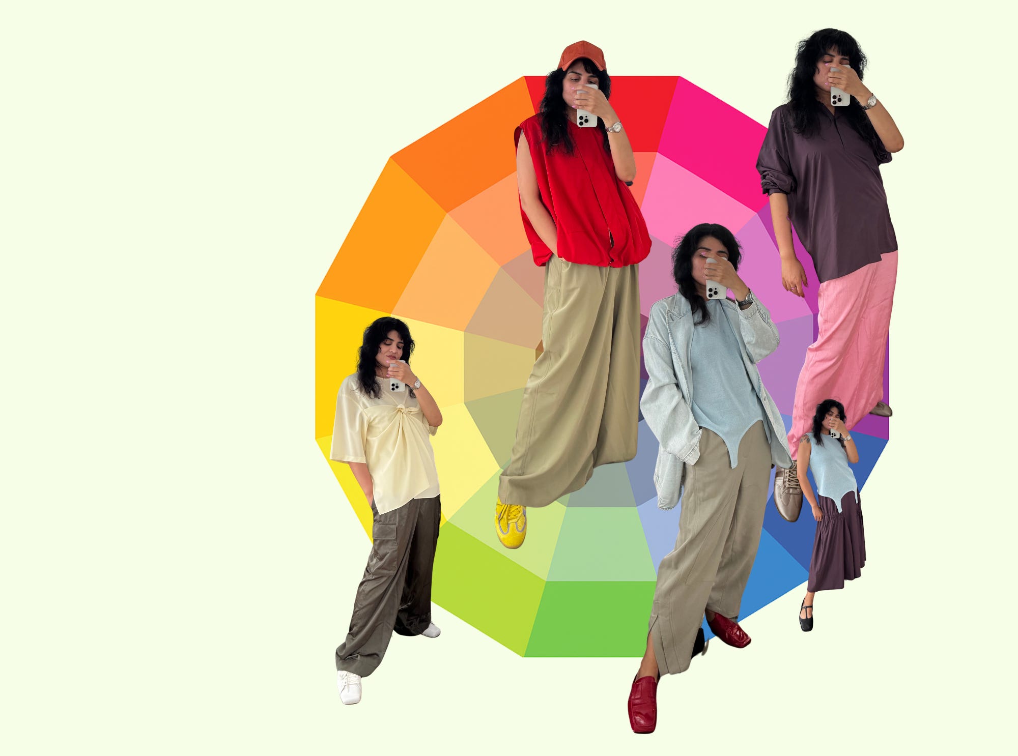
Fit Happens Color Formula #3: Flirty Neighbors
Pairing tops to bottoms. Neighboring colors only. But not the same mood. That’s the rule.
What a coincidence that everyone’s writing about color right now, right?
WRONG. This particular newsletter is not a random cosmic occurrence. This is cause and effect. Specifically:
Here’s the thing: I love color. I rely on it so hard that my Typography professor in grad school once banned me from using it. Like actually prohibited me from adding so much as a tinted square in my layouts because I was using it as a crutch. And he was right. But also? We’re not in school anymore. I am free. And I will color-code my way through life, outfits, and substack if I want to.
Lately, I’ve been in awe of how
and broke down aspects of their personal color systems. I deeply respect people who can explain something intuitive in a way others can use. That’s the real magic, right? If you can teach it, you understand it.So here’s me trying to explain something I feel. I don’t have a grand theory. Just a few formulas I fall back on when I want to look like myself and not think too hard.
Today’s formula: Let’s just call it Fit Happens Color Formula #3: Flirty Neighbors
You didn’t miss anything, this is the first post in this series and I am starting with Formula #3. BECAUSE, it is the juiciest one for the summer. This one’s for when you want to be colorful but not matchy. It is BOLD, it is FUN. It is potentially scary? But follow along I promise this can work. It might feel advanced but I have faith in you.
Here’s how:
You know the color wheel. VIBGYOR. The rainbow loop? (Red, Orange, Yellow, Green, Blue, Indigo, Violet…I’m not typing that again.)
Now wrap that rainbow into a circle. Boom: color wheel.

Analogous colors are just colors that are next to each other on that wheel.
So: Blue + Green. Red + Orange. Violet + Blue. That sort of thing.
Got it? Great. Now apply this:
The Formula:
Top: A color. Any color.
Bottom: Another color next to it on the wheel (remember analogous colors above?)
Shoes: Whatever matches the vibe. Some cheats:
White = crisp,
Brown/grey = grounded,
Metallic = glam, or beachy chill if muted metallic like champagne
A third, bright color = playful chaos (high risk, high reward)
Black = brings edge to the look
The kicker: Top and bottom can't be the same mood aka hue and saturation.
Not for this formula.
If your top is bright blue, your bottom can’t be bright green. Make it a muddy green. Or a neon green.
If your top is lavender, don’t do pastel mint. Try chartreuse or murky olive.
If you go with red + orange, do a crimson top with a bright orange bottom. Or vice versa.

See, if you pick red from the outermost ring, pick orange from the 2nd, 3rd, or 4th ring.

Think of it like a block party with all the neighbors: one’s moody, one’s hyper, and one brought a disco ball. We want different energies, same family. One might say we want….you guessed it, FRICTION!
OK, Examples. Let’s look at how this actually plays out:
Baby Pink Skirt + Deep Purple top + Taupe-y Champagne Shoes
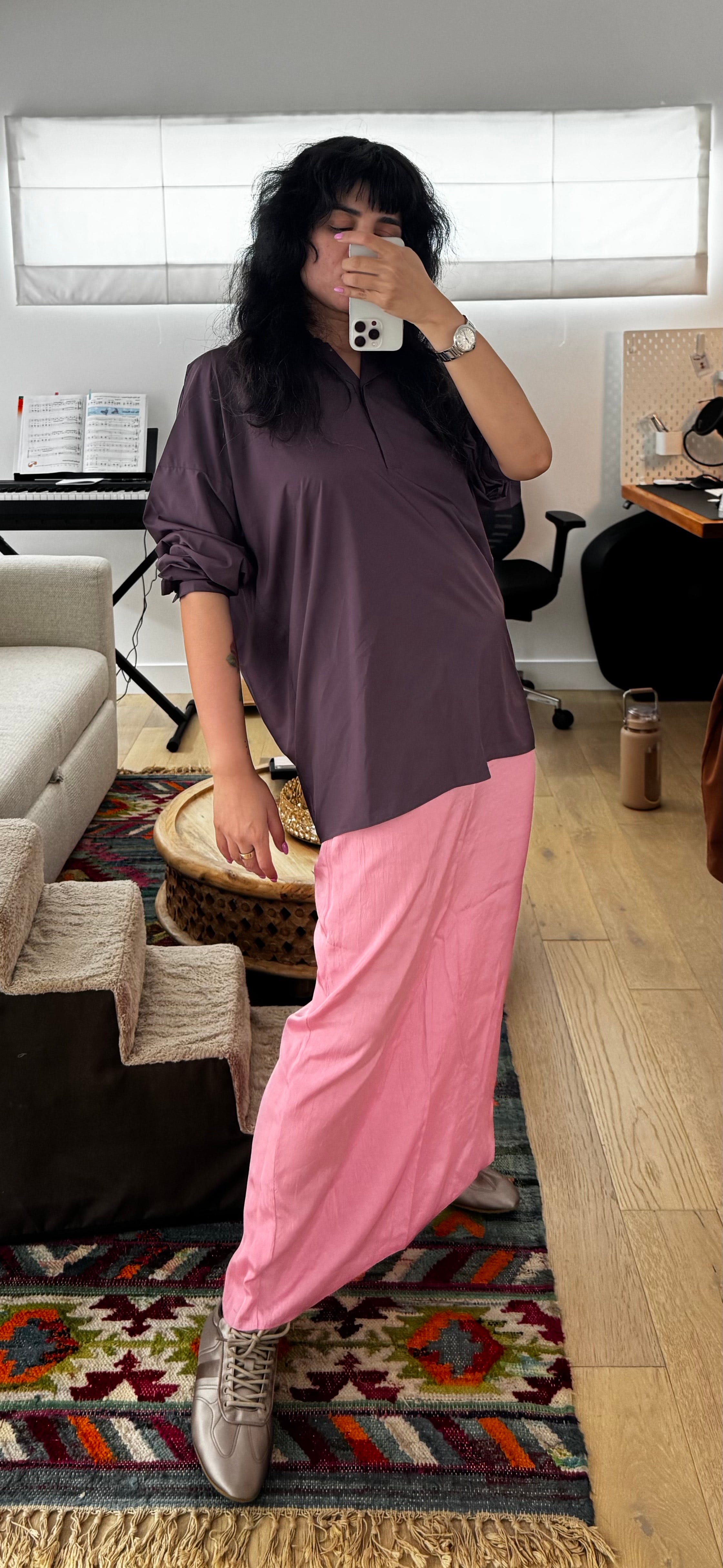
See how they are not the same shades? Had I picked a lavender shade of purple vs this deeper one, it might have worked out but it wouldn’t be this Formula.
Butter Yellow Top + Olive Green Pants + White Shoes
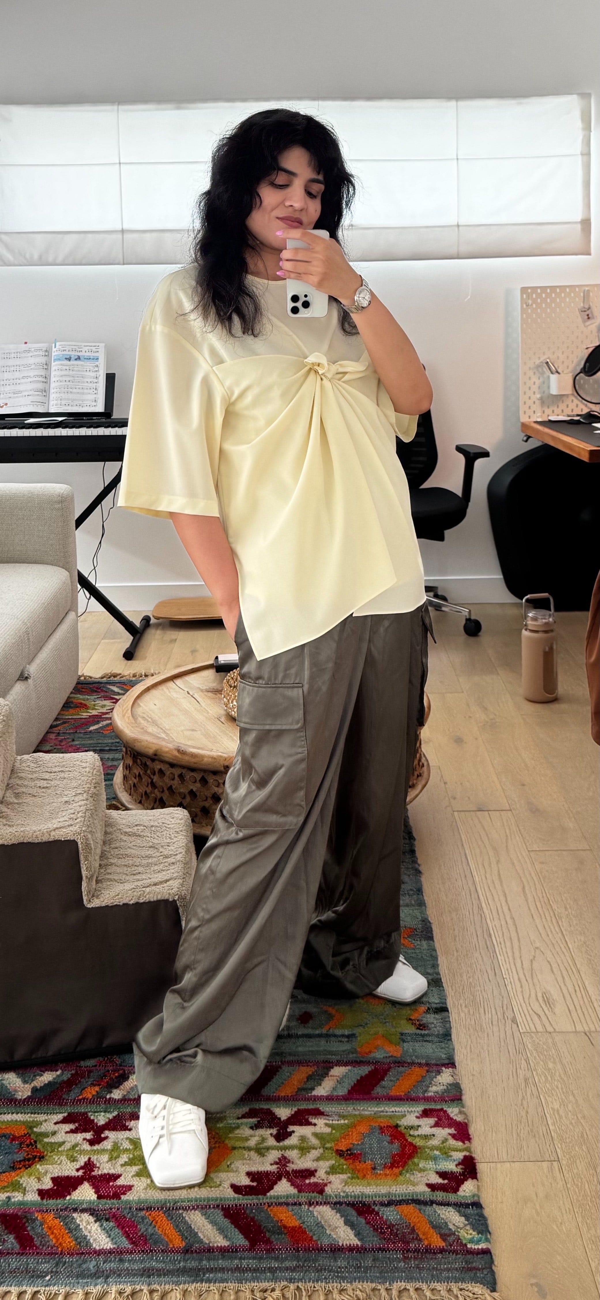
Btw, I have two pairs of these pants (two different sizes). I love them SO much and I am doing a giveaway for these in size 10. Details and how to enter in this post. Enter soon if you’re interested, I will close it on Wednesday.
Red polo + Pink Skirt + Ring 3 Brown Sandals
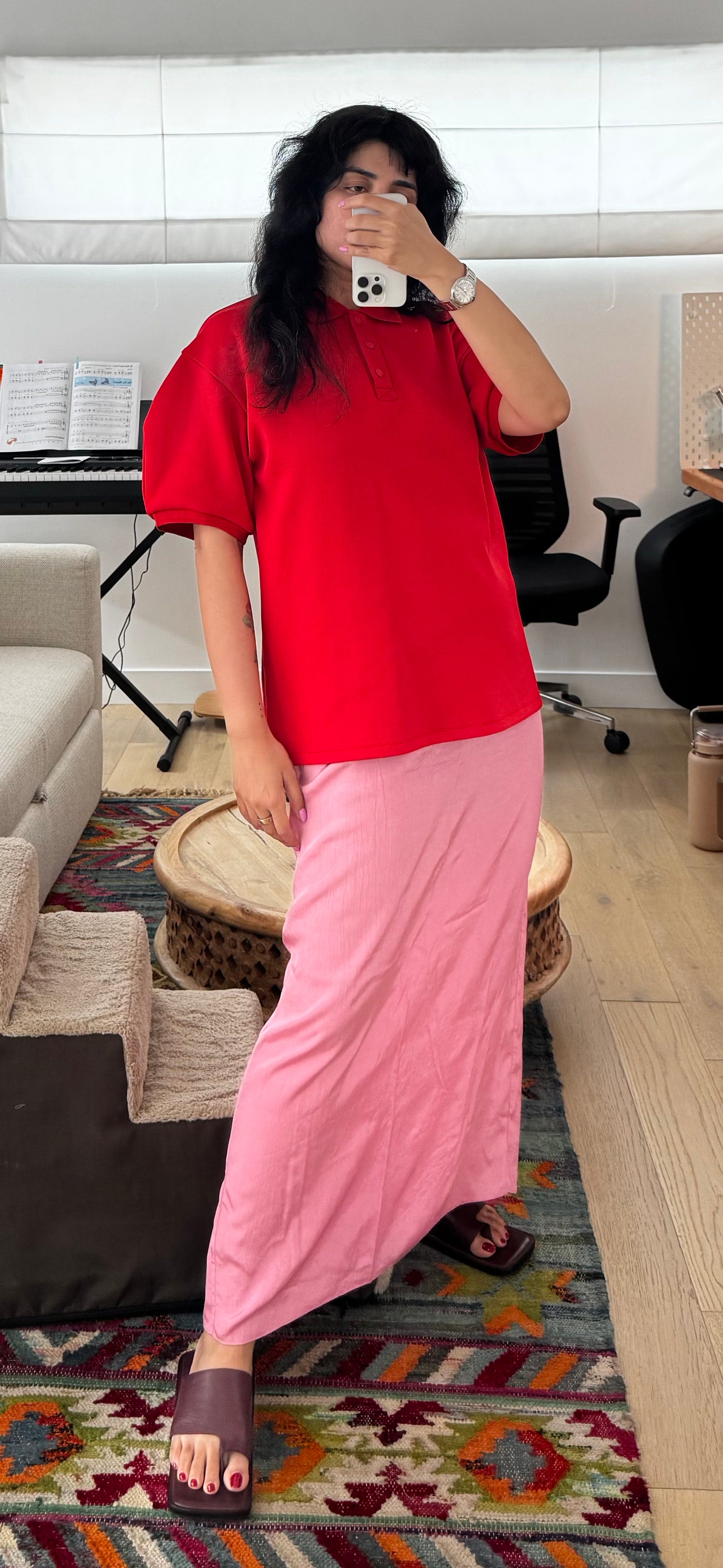
See? Last time we went to Purples to pair with the Pink, this time we went Red. Same concept, still works.
Blue top + Purple Skirt + Black Shoes
This look felt very sweet to me. Adding black shoes balanced that out a bit.
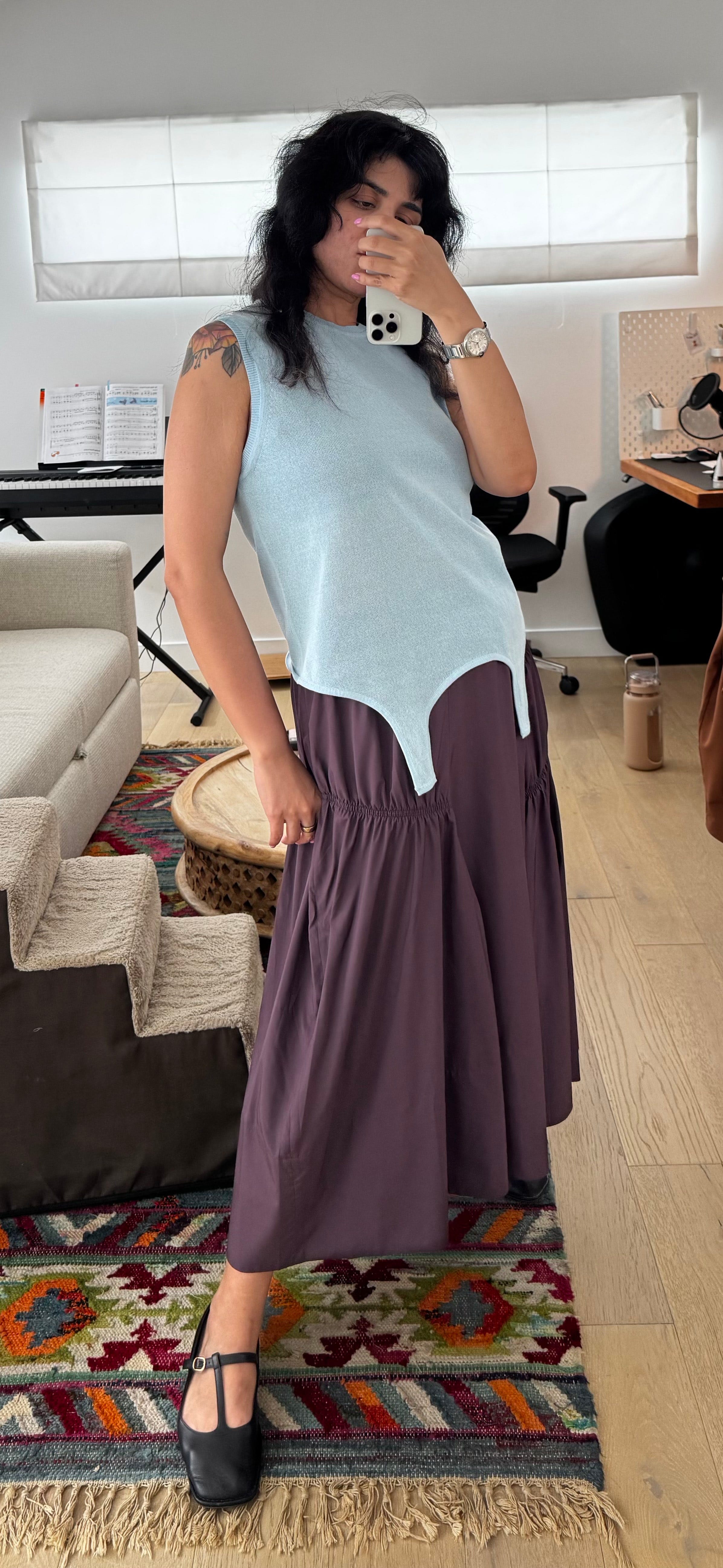
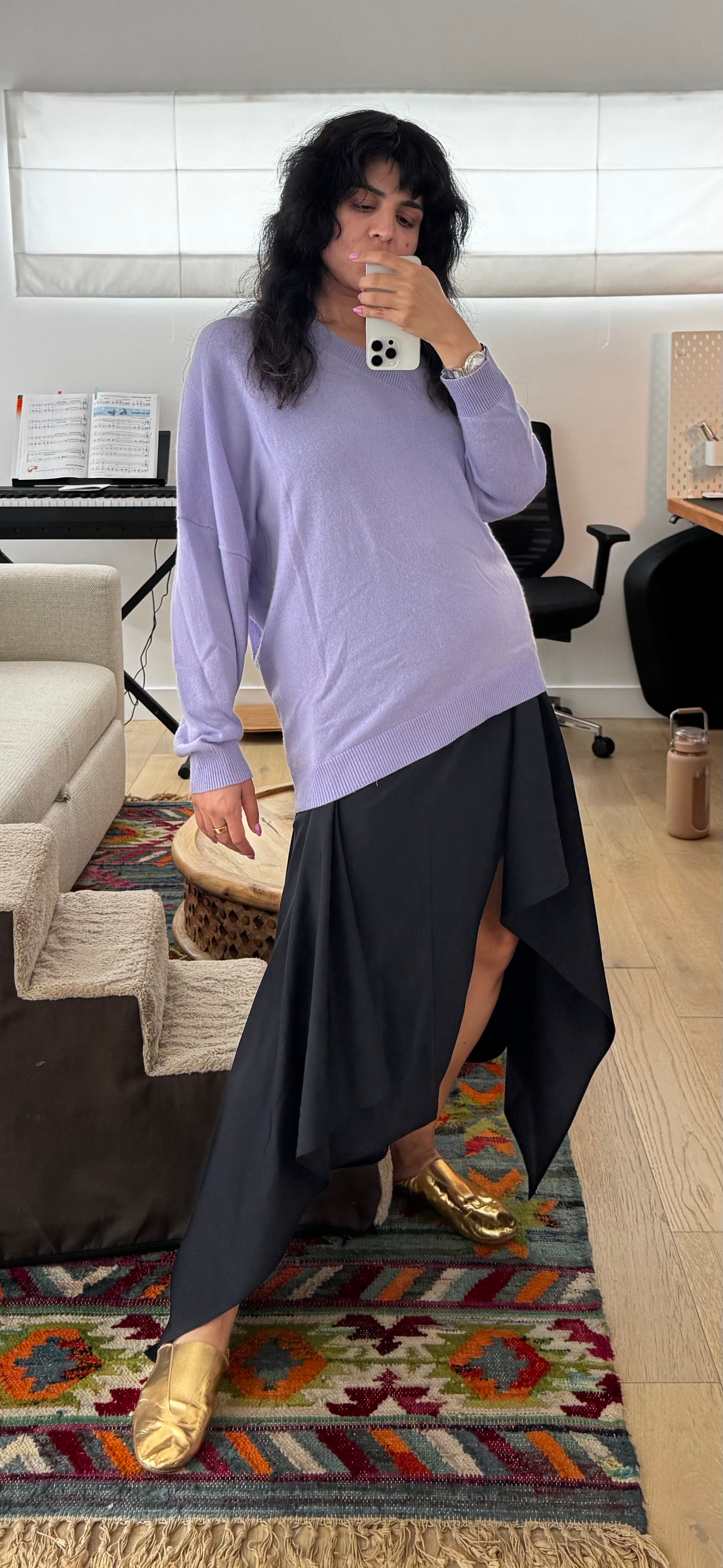
Lavender sweater + Navy Skirt + Lime1 shoes
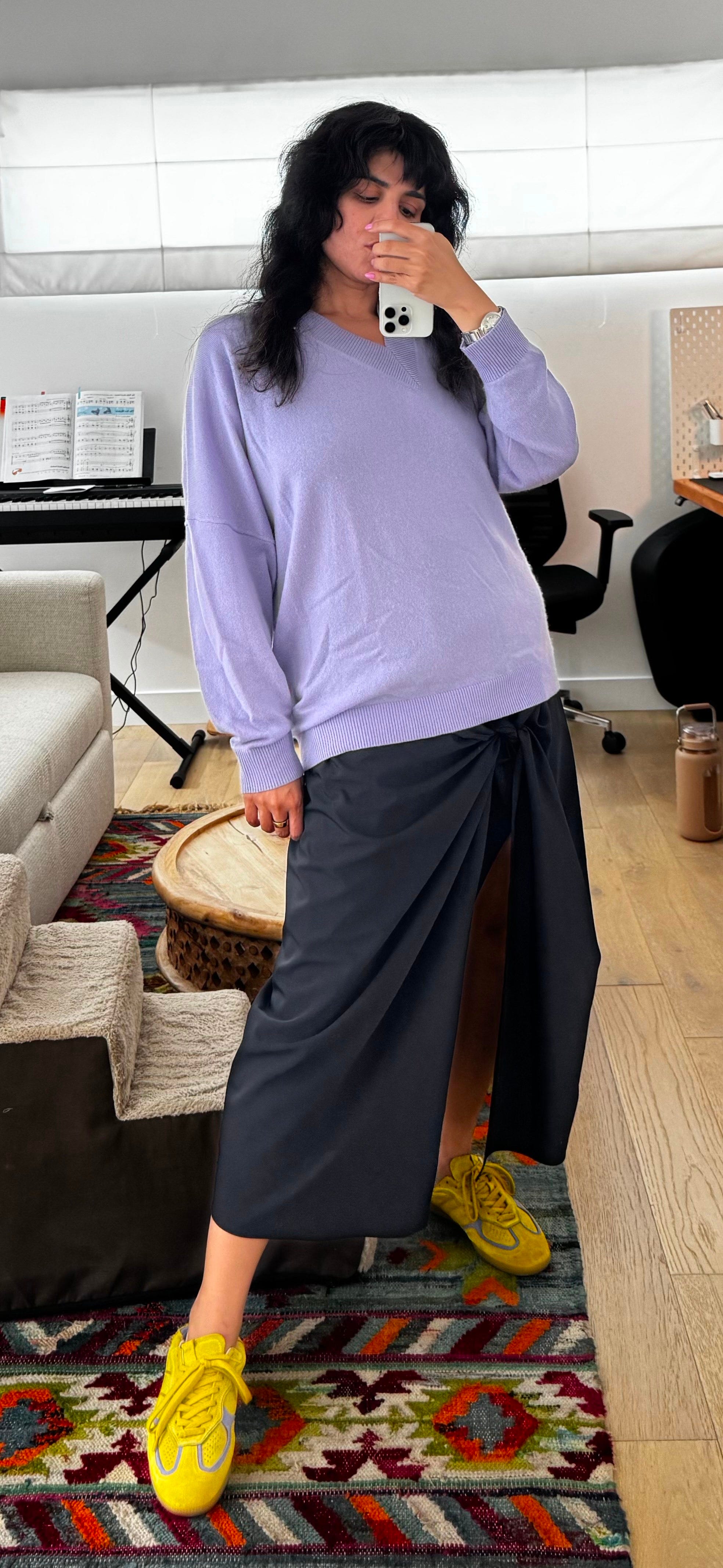
See how shoes in another bright color makes the whole look feel more fun? Now for a compare and contrast, if I wanted to feel more glam instead I would just swap the lime shoes with gold ones.
Want to see how we can use for troubleshooting outfit colors? Say you want to wear this red vest with these green-ish pants. It looks good as is, but you want to do more to make the colors look good together.
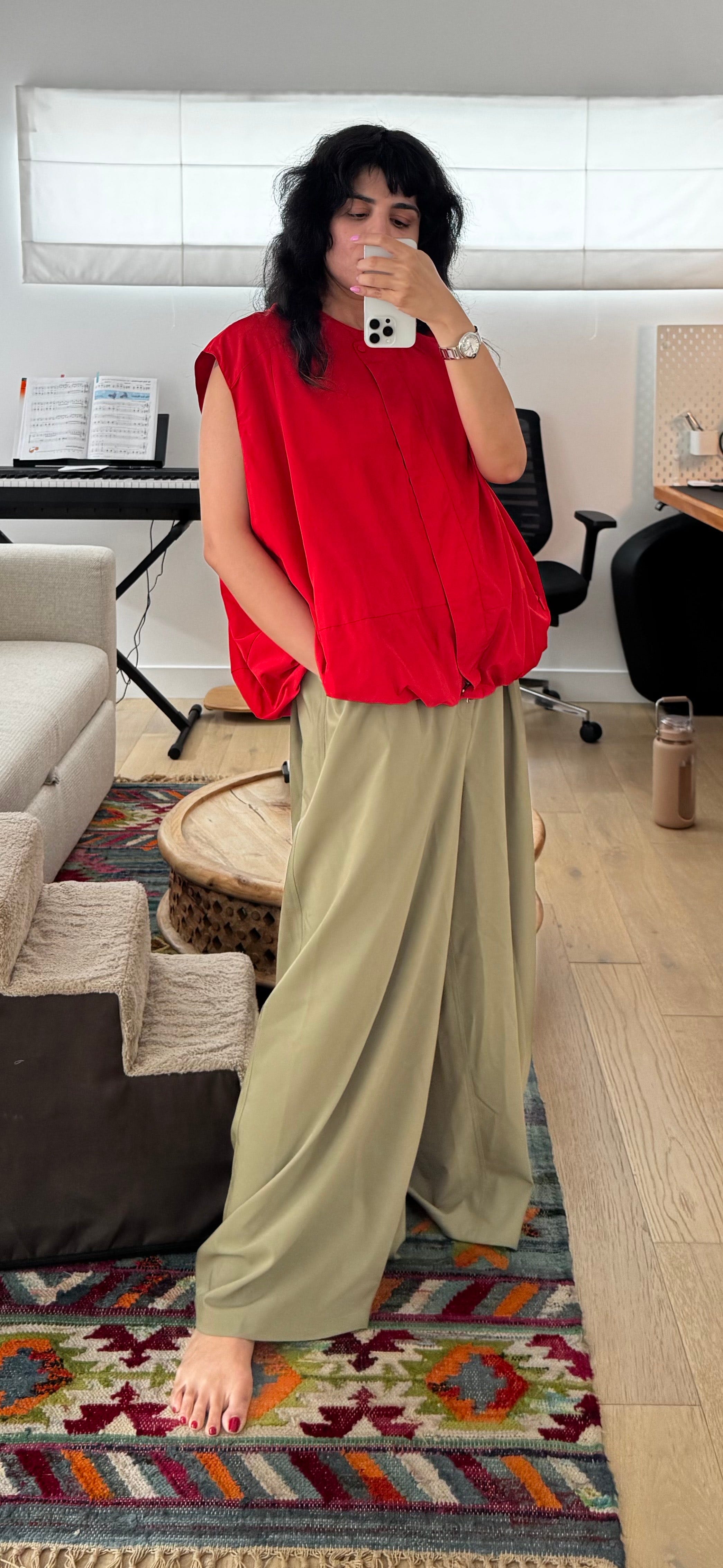
Let’s go back to the Rainbow. VIBGYOR. Green and Red are separated by Yellow and Orange. Well well well, let’s try adding those two colors.
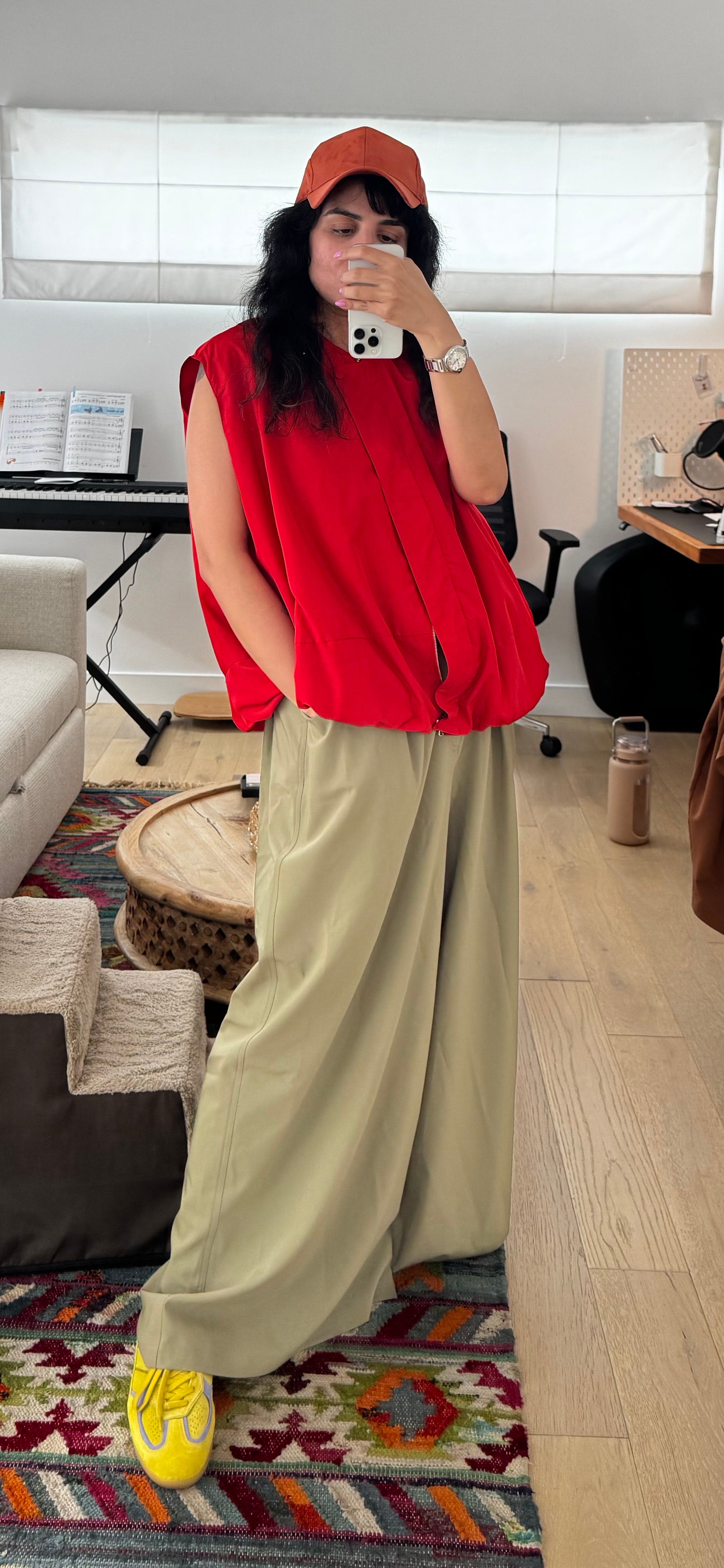
“But OK Asta, I don’t wear hats”. Why, they so cute! But my point is, it doesn’t matter. Wear any accessory in an orange shade. Bag, big earrings, belt, anything. Like here I put on a blazer instead.
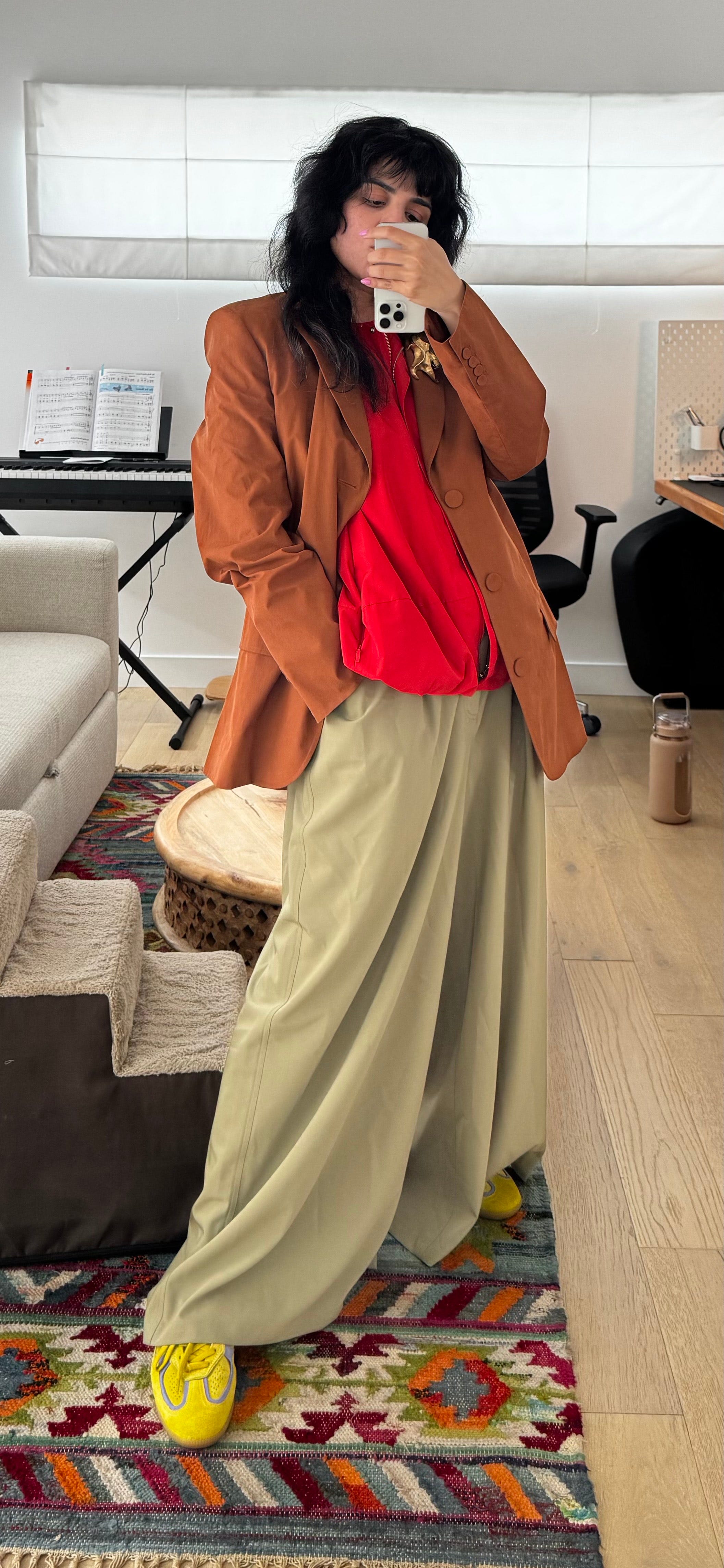
See?
I could keep doing this forever but you’ve got things to do and I need to go touch grass. So let’s leave it here for now.
When to Use Formula #3:
When you need a pick-me-up and coffee(or in my case, matcha) isn’t cutting it
When the sun is shining and you want to match its energy
Or when it’s not shining and you feel like being the light
When you want to be playful
When you’re tired of your neutrals and want a BIG break
When you’re feeling a little extra and want to own it
When there’s something to celebrate. Or when you are the celebration
When you want to remind yourself you’re allowed to take up space
This formula isn’t for fading into the background. It’s for showing up!
More color formulas coming soon (there are at least three living rent-free in my brain, sneak peek: They are called Formula #1, #2, and #4), but I wanted to start with this one because it’s easy to pull off once you get it, and the payoff is BIG. It makes you look like you are a pro. Like you're fluent in color, not just guessing. AND it is so appropriate for summer. That said, I acknowledge it is BOLD but y’all, we go big or go home.
And if you're reading this thinking “But I’m a neutrals girl…”, cool, same (sometimes, as a palette cleanser). This formula works just as well with toned-down or “ish” versions of color. It’s about adjacency and contrast in texture, mood, and tone. Not just the brightness. Like here:
Blue-ish top + Blue-ish blazer + Green-ish pants + Red shoes
As always, wear what makes you feel you. If you get stuck, ask me in the Fit Happens chat. I am here to partner with you on color play or anything else, really! Thank you thank you, hope this helped.
All links in this post are gathered here. Some links are affiliate links, no extra cost to you. Thank you for your support! I link sold out items also because having name and access to product shots sometimes makes it easier to find the products pre-loved.
A note about ring 3 ish colors. If a color can be either of two colors, like these lime shoes could count as yellow or as green, it literally means just that. That is, for this formula, you can use them to stand in for green OR yellow. This is why I LOVE ring 3 colors. They add so much versatility to your closet in terms of color play.
This is- frankly- brilliant!! But more than the actual idea; your photographic prove of this formula in action is beyond impressive!! I vote this post as one of the most interesting color posts ever!!
OH
Seriously! I have been yearning for a true artist to explain color theory to me, and especially color theory as it relates to fashion, FOREVER.
This is so uniquely intriguing and clearly explained. I also feel like it’s the tip of the iceberg and I would like more classes please.