Lines and Shapes, part 2: Let’s look at clothes
How designers use lines and shapes to tell visual stories and how you can learn to read them.
We’re back with part 2 of Lines and Shapes! If you missed part 1, go read that first. It lays the groundwork for everything that follows. I know some of you like to skip ahead, but seriously, this won’t land without the setup. I’ll wait.
…
All done? Great.
Now let’s move on to spotting these lines and shapes in actual clothes. I’m spending a whole post on this because while we looked at clear-cut examples in costuming last time, real-life clothes are rarely that obvious. Costume designers are tasked with making a visual point quickly. So it’s easy to spot verticals in Suits, or soft curves in Bridgerton. But the clothes we wear every day are much more nuanced.
That’s why, in this post, we’re deep-diving into brands we actually know, wear, or scroll past regularly. My hope is that by the end of this, you’ll start noticing line and shape patterns not just in styled characters but in your own closet, and in the world around you.
We’re going to train our eyes by comparing designer labels with distinct visual philosophies and looking at some of their most recognizable silhouettes. This isn’t about which one is better or what you should prefer. It’s about the deep dive, the why behind the vibe.
A quick recap: Lines vs. Shapes
Let’s quickly review the emotional language of lines:
Vertical = strength, direction, authority
Horizontal = ease, rest, grounding
Diagonal = energy, tension, movement
Curves = softness, playfulness, openness
Lines are the literal lines in a garment. The way a lapel is cut, the slope of a sleeve, the outline a hem makes against the body. Shape is what happens when all those lines connect: it’s the overall form the garment creates in space. We look at both together to understand a piece. Allow me to explain with an example.
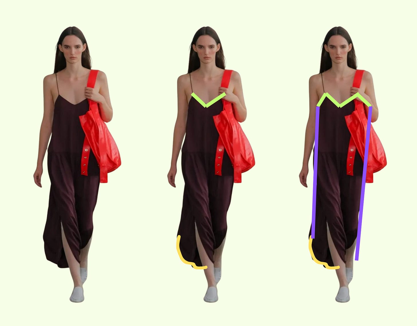
This Tibi strappy jalouise dress, it has all kinds of lines, as any garment will likely have. However, the LINES that might be the most unique or noticeable might be those diagonals of the neckline. Maaaybe the curves at the bottom hem. Does this mean this dress is all energy, tension, movement? Not quite, because see once you join all the lines in the garment, the SHAPE it creates is basically a long skinny rectangle. So the shape is still purely vertical. The overall feel of this dress is exciting because of that diagonal neck and playful because of the curves at the hem, but it still holds on to that vertical shape that is a Tibi signature.

Let’s look at a different example now. This Jacquemus skirt.
This too has a strong diagonal LINE. BUT, once the lines of the skirt mean we see it also has a strong diagonal SHAPE, a triangle. That combination of diagonal + diagonal gives it a strong sense of energy, movement, and less of the strength and authority we saw in the Tibi dress.
If this feels abstract, don’t overthink it. Just look at the garment and ask yourself: What’s the first thing that jumps out at me? Trust your instinct. You already know how to read this stuff.
And if you don’t believe me, I draw your attention to the Kiki and Bouba experiment. In a 1929 psychology study (and again in 2001), people were shown two shapes (one jagged, one round) and asked which one was named “Kiki” and which one was “Bouba.” Almost everyone said the spiky one was “Kiki” and the round one was “Bouba.” That’s how universal visual language is. You already speak it. All I’m doing is giving you the tools to notice.
Good? Good.
Why lines and shapes matter
I almost skipped this nuance and jumped straight into examples. But it’s worth sitting with this for a minute: sometimes the lines in a garment say one thing, and the shape says another like in the Tibi example above. That friction is where things get interesting. It’s why a structured dress with round edges might feel like “tough romantic.” Or why a straight skirt with jagged edges might feel “sharp soft.” You don’t need to memorize anything, just start observing.
And now on to a side by side
For this comparison, I picked:
Tibi (obviously), because I know it deeply.
Dôen, because their philosophy is clearly spelled out, visually consistent, and clearly contrasted from Tibi’s.
I should caveat: I don’t know much about Dôen, but that’s kind of the point. I’m looking purely at the clothes. This is a graphic designer’s read on what the lines and shapes are doing.
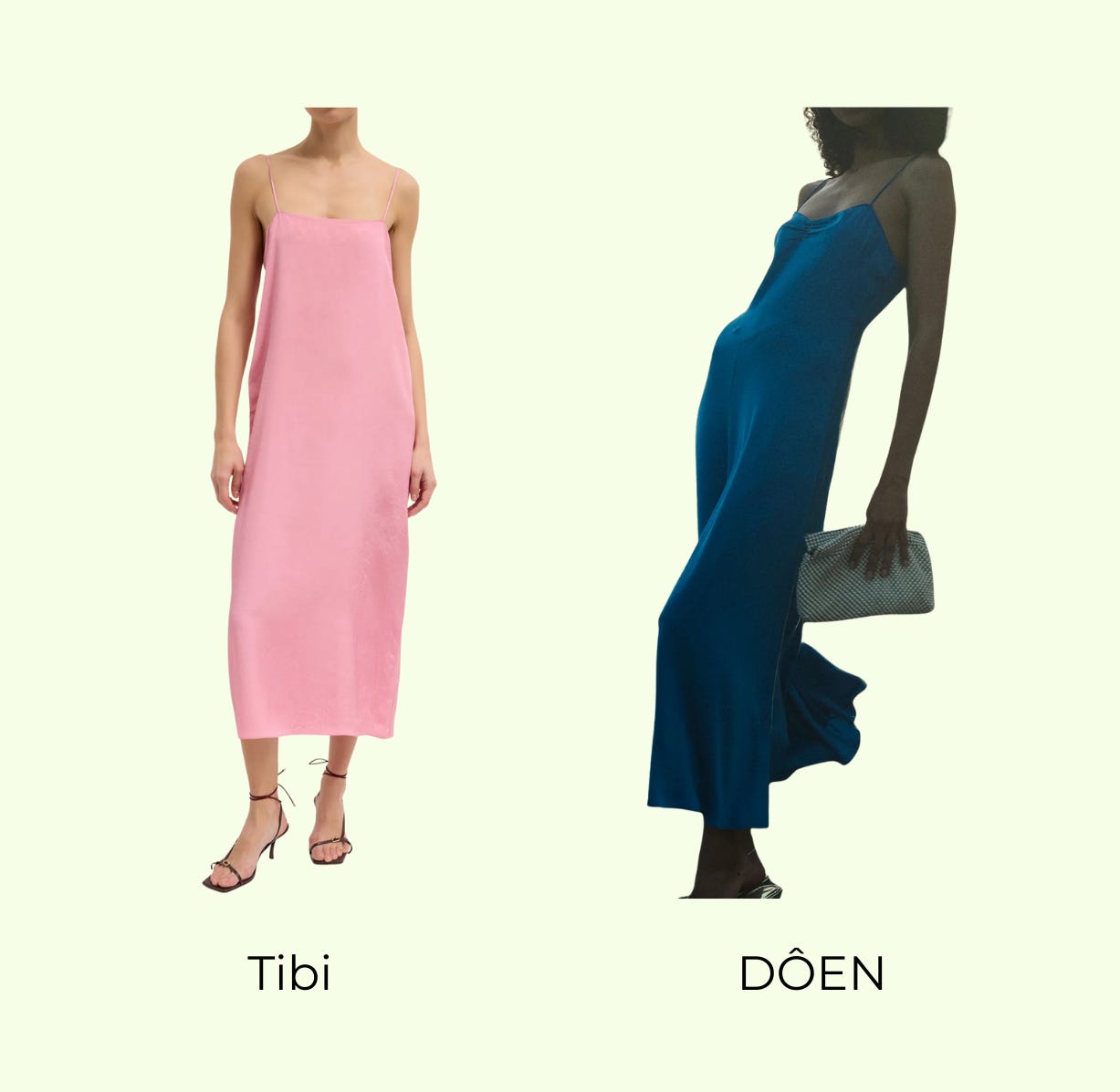
Let’s look at a slip dress by each designer. We’ll start with the flatlays where the design intention is most visible and then look at what shifts once they’re on the body.
Tibi gives us a classic vertical column. In the flatlay, you’ll notice a slight outward curve at the hips, but that’s not design ornament, it’s practical. That subtle shaping ensures the dress reads straight on the body, not tight across the hips. The silhouette is still a clean rectangle, made up entirely of vertical & horizontal1 lines. Even the neckline and hem are flat, reinforcing the geometry. The final read: modern, minimal, and confident.
DÔEN isdirectional in every sense. The bias cut pulls the fabric diagonally across the body (the green line I drew in the middle of the dress), hugging curves and then releasing at the hem in soft waves. The bust seam cuts across on a diagonal. The hem curves. Nothing here is straight. Even when laid flat, the dress looks like it’s in motion. Notice how the sides of the dress read diagonal in a flatlay, however we will see they become more curved once the dress is on the body. It’s more body-revealing than the Tibi. Not because it’s tight, but because it follows the body’s natural diagonals and curves. The energy here is movement, romance, and softness, all built through slant and shape.
When we see it on the body:

Once worn, these dresses reveal their true geometry. The body activates certain lines. Fabric tension changes the silhouette. And subtle design choices that were barely noticeable in the flatlay become much louder, or disappear entirely.
Tibi becomes even more vertical on the body. That slight flare at the hip, visible on the hanger, vanishes and instead that horizontalness now presents itself as ‘space’ and ‘ease’. A flat neckline reinforces the linearity. The fabric hangs cleanly from shoulder to hem, barely touching the body, creating a sharp but soft rectangle.
DÔEN comes fully alive in motion. The bias cut wraps around the torso on a diagonal, exaggerating every curve of the body and hence taking on a curved apperance itself. The bust seam creates lift and roundness; the skirt flares out as the fabric moves. Unlike Tibi, which largely maintains its flatlay geometry, Dôen’s shape transforms from fluid triangle to soft hourglass and almost like a ripple in motion.
The shape of a garment isn’t fixed. It shifts in motion, in context, and especially on the body. And even within a narrow category like slip dresses, you can see completely different emotional messages just through the direction of lines and the structure of shapes.
Tibi is a long rectangle that sits away from the body. Eased out, vertical, and modern.
DÔEN is curved, diagonal, and in motion which translates to soft femininity, expressiveness, and fluidity.
Let’s now look at a few more popular DÔEN pieces. Remember how I said real clothes carry more nuance than costumes? This is where that really starts to show up. You don’t need to name every single line and shape in a garment. Just ask: What’s the first thing I notice?
For me, it’s the curves.
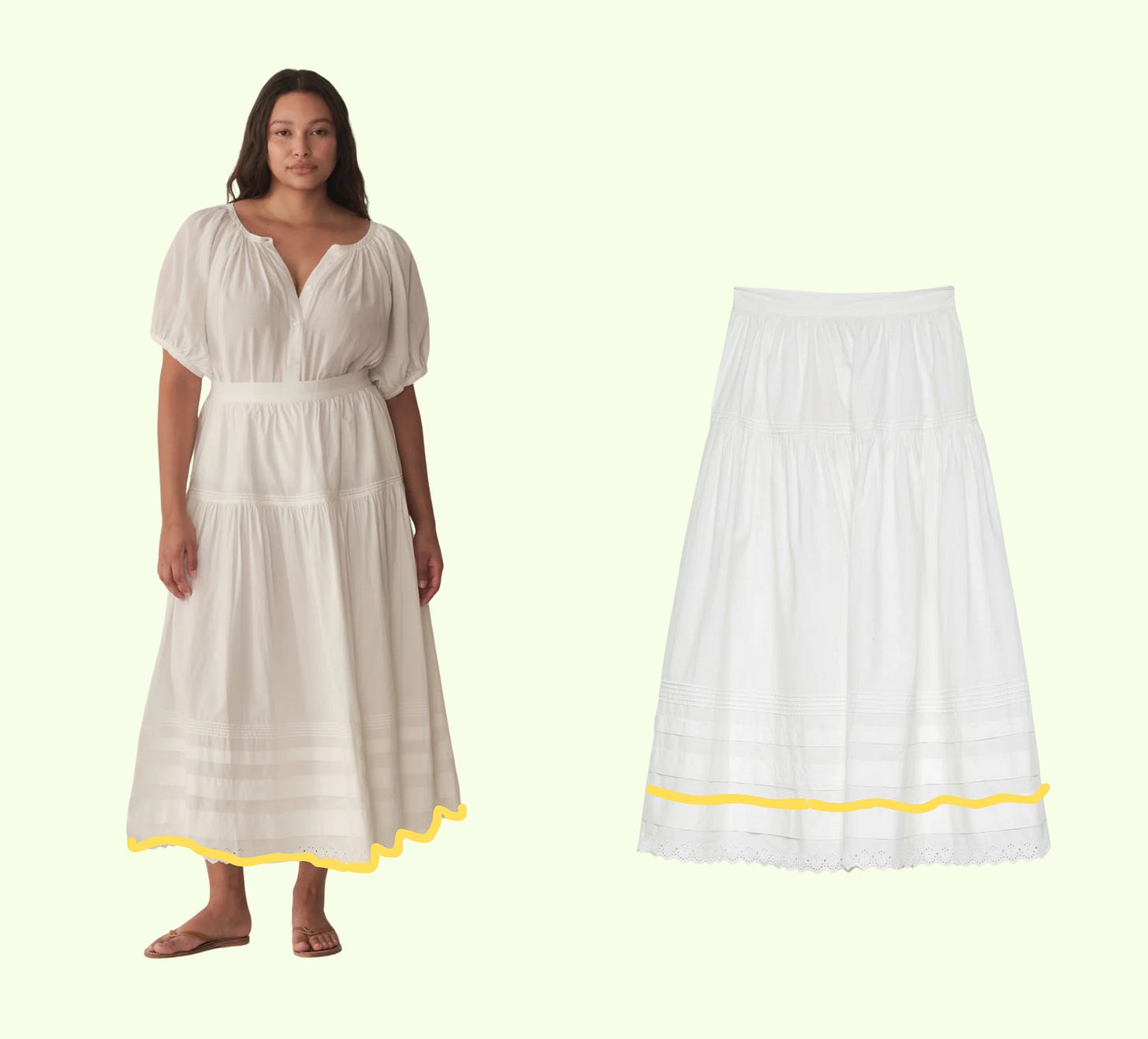
Take the Sebastiane skirt. Even the horizontal lace bands feel curved, thanks to how the fabric is gathered. Those are technically straight lines but the construction makes them read soft and round. The skirt moves like a breeze rather than marching in a direction. It’s horizontal, yes, but softened into a curve. The diagonals in the panels? Also curving slightly, never sharp. This is playful femininity expressed in lines that drift, not slice.

The Paige short is another great example. You get diagonals here, especially in the hem, but they’re curved diagonals, not geometric or technical. If Margiela did a short like this, the diagonals would probably be crisp, directional, maybe even aggressive. But DÔEN’s version feels like a diagonal drawn with a paintbrush.
Then there’s the Henri top, which—do I even need to say it?—is just curves on curves on curves. But again, they’re not static. The ruffle along the neckline curves and flows. There’s always some implied motion in how the fabric hangs or shifts.
That’s the key theme I’m noticing: DÔEN’s curves are almost always in motion. They’re not decorative. They’re not still. They move. They swirl. They direct your eye diagonally, or around the body. They give softness with energy.
Let me show you a contrast.
Here’s a designer who also uses a lot of curves, but almost always along horizontal shapes: Comme des Garçons (Yes, I’m using a Captain Obvious example, forgive me.) The result? Stillness. Zen. Curves that feel composed. The final read is calm, maybe even meditative. Still feminine, but not expressive in the same way DÔEN is.
Same visual tool, i.e. curves. Completely different emotional impact. Why? Because of direction.
Curved horizontals = gentle, resting, still
Curved diagonals = fluid, playful, in motion
(Also, side note: are we all copy-pasting that special character every time we type Dôen or long pressing the key? Because it’s driving me insane.)
So what are we seeing?
DÔEN doesn’t just use softness, it uses moving softness.
Its lines curve and drift, rarely landing with clarity or edge.
Its shapes build volume without rigidity.
The result is clothes that don’t stand still.
Now to check my work, I looked at their website to see how they describe themselves (part of why I picked a brand I’m less familiar with—to remove the bias I know I bring to a brand like Tibi).
From their About page:
The collections themselves would be a celebration of womanhood, designed with a keen reverence for the landscapes of their youth - grazing oak groves and orchards and looking out on serene, soft hues of the oceans. Meticulously crafted to pass on for generations, the garments evoke a timeless whimsy and an unapologetic femininity.
Ding ding ding. They know exactly who they are and they know how to show it in their clothes. (Obvi.)
I could keep going with this (honestly, forever), but you don’t have all day. So let’s start wrapping here.
In this post, we’ve looked at lines in motion, shapes in stillness, curves that rest, and curves that run. That’s all clothes are: lines and shapes arranged in space to tell a story.
And now, you know how to read that story a little better.
I’ve been sitting on this post for far too long. Mostly because this is a lot of theory to explain, and I wanted it to be both clear and comprehensive while not making this a novel. Thanks to
, , , , , and for helping me get unstuck on this (it took a village!).TELL ME how the concepts are landing for you. If it clicks, amazing. If it’s still fuzzy, that’s fine too, I’ve got Part 3 coming.
That next one will bring the discussion back to... you. We’ll talk about your style words (or themes), and how those might translate into line and shape choices in your wardrobe.
If you need help figuring out your three words before we get there, here’s a past post where I shared how I crystallized mine.
See you soon!
My husband pointed out the bottom hem looks curved here. Ignore that, you will see in the model photo that is simply an artifact of a flatlay. This is why you need to see clothes on a body, preferably YOUR body because they take on a different shape then.


This is so good and makes so much sense, although I never could have thought of it. I just went through the flat lays in my Indyx and have identified that virtually every piece I struggle to style has a diagonal/curve combo that gives my clothes a fluidity I don’t like. I’m amazed!!
This was so incredibly clear and helpful. I’m definitely looking forward to part 3!